library(ggplot2)
library(deming)Welcome to my first computational post! I thought of starting of with basics and revising PCA (Principal Component Analysis) since it is an important concept.
To get a better understanding, watch StatQuest videos by Josh Starmer:
Extra reading: Lindsay Smith post
Useful link for R beginners: R cookbook
I’m going to go step by step and see how I can make this by myself and also then use packages to give a real life example.
PCA finds the best fitted line by maximizing the sum of the squared distances (SS distance) from the projected points to the origin. The distances are squared so the negative values don’t cancel out the positive values.
In practice, the number of PCs is either the number of variables or the number of samples, whichever is smallest.
Once all the PCs are figured out, you can have eignevalues (SS distance) to determine the proportion of variation that each PC accounts for.
Usually, PC1 and PC2 have the highest eigenvalues, so we rotate the axes until PC1 is horizontal and PC2 is vertical. Then you can project points from PC1 and PC2 to get the samples.
Let’s make our sample data. I’m going to make 6 samples with 5 genes expression data.
data = data.frame(Samp1 = c(14,4,1,7,3),
                  Samp2 = c(13,3,8,2,1),
                  Samp3 = c(8,7,8,16,5),
                  Samp4 = c(2,10,3,23,2),
                  Samp5 = c(4,20,9,5,10),
                  Samp6 = c(5,16,10,12,2)
                  )
rownames(data) <- c('Gene1','Gene2','Gene3','Gene4',"Gene5")

data <- t(data)
Make a scatter-plot of Gene1 vs Gene2
x = data[,'Gene1']
y = data[,'Gene2']
plot(x,y, xlab = 'Gene1', ylab = 'Gene2') 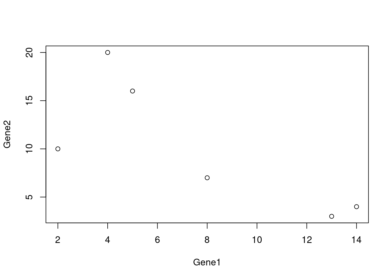
Center the data and shift it to the origin
# Create scatterplot
plot(x, y, main = "Centered Scatterplot", xlab = "X-axis", ylab = "Y-axis")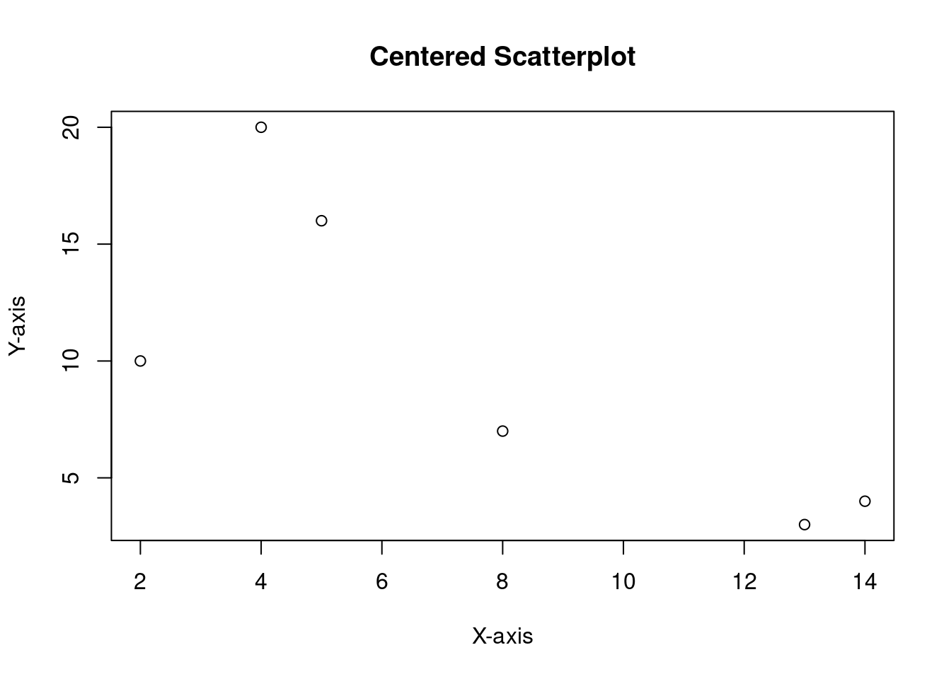
# Determine the range of x and y values
x_range <- range(x)
y_range <- range(y)

# Calculate the center of the plot
x_center <- mean(x_range)
y_center <- mean(y_range)

# Set the new limits for x and y axes to center the plot
new_x_range <- x_range - x_center
new_y_range <- y_range - y_center

# Subtract the mean values from each data point
centered_x <- x - x_center
centered_y <- y - y_center


# Adjust the plot limits to center the scatterplot
plot(centered_x, centered_y, xlim = new_x_range, ylim = new_y_range, main = "Centered Scatterplot", xlab = "X-axis", ylab = "Y-axis") + abline(h=0, lty = 2) + abline(v=0, lty = 2)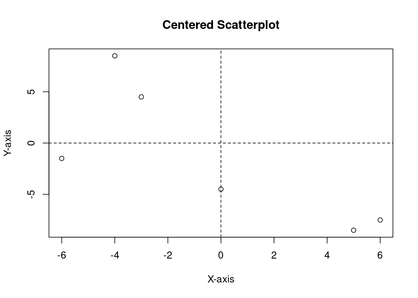
integer(0)We now need to understand the difference between Ordinary Least squares (linear regression) and total least squares (orthogonal regression).
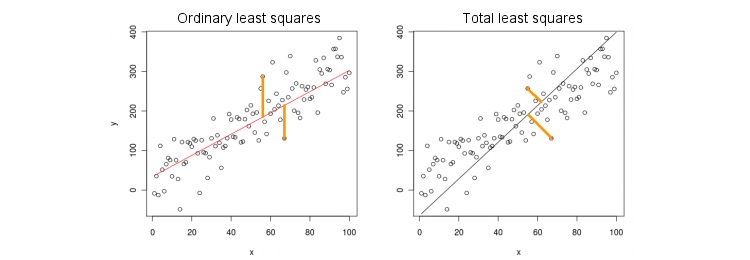
Orthogonal regression
model <- deming(centered_y ~ centered_x)
plot(centered_x, centered_y, xlim = new_x_range, ylim = new_y_range, main = "Orthogonal regression", xlab = "X", ylab = "Y")
abline(model, col = "red")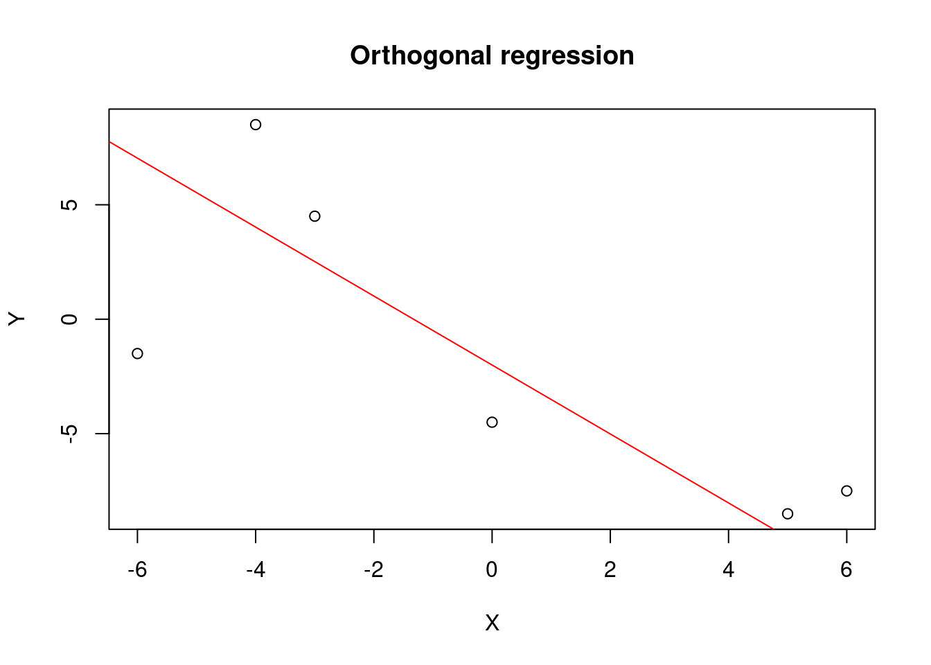
Linear regression
model <- lm(centered_y ~ centered_x)
plot(centered_x, centered_y, xlim = new_x_range, ylim = new_y_range, main = "Linear Regression", xlab = "X", ylab = "Y")
abline(model, col = "red")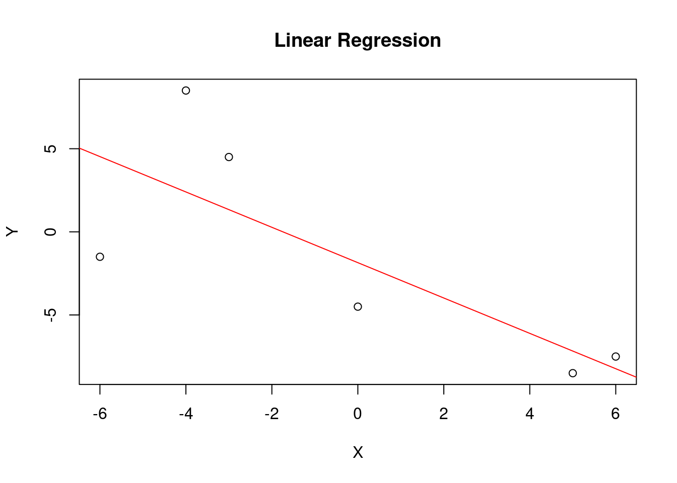
Calculate the covariance matrix
cov_matrix <- cov(data)
eigen_result <- eigen(cov_matrix)
largest_eigenvector <- eigen_result$vectors[, which.max(eigen_result$values)]
pca_scores <- data %*% largest_eigenvector
plot(data, main = "Data and Principal Component")
abline(a = 0, b = largest_eigenvector[2] / largest_eigenvector[1], col = "red")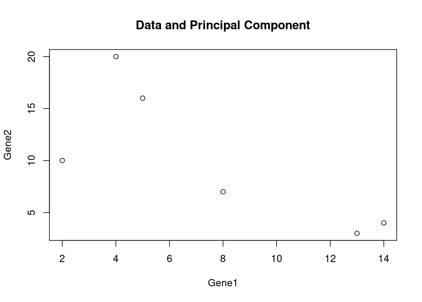
How much variation does each PC explain?
The eigenvalues from the covariance matrix tell us exactly that – each eigenvalue is the variance captured by its corresponding PC, so dividing by the total gives the proportion of variation explained.
var_explained <- eigen_result$values / sum(eigen_result$values)
names(var_explained) <- paste0("PC", seq_along(var_explained))
round(var_explained * 100, 1)
PC1 PC2 PC3 PC4 PC5
52.4 38.3 5.7 2.8 0.7 barplot(var_explained * 100, ylab = "% variance explained", main = "Scree plot",
col = "steelblue")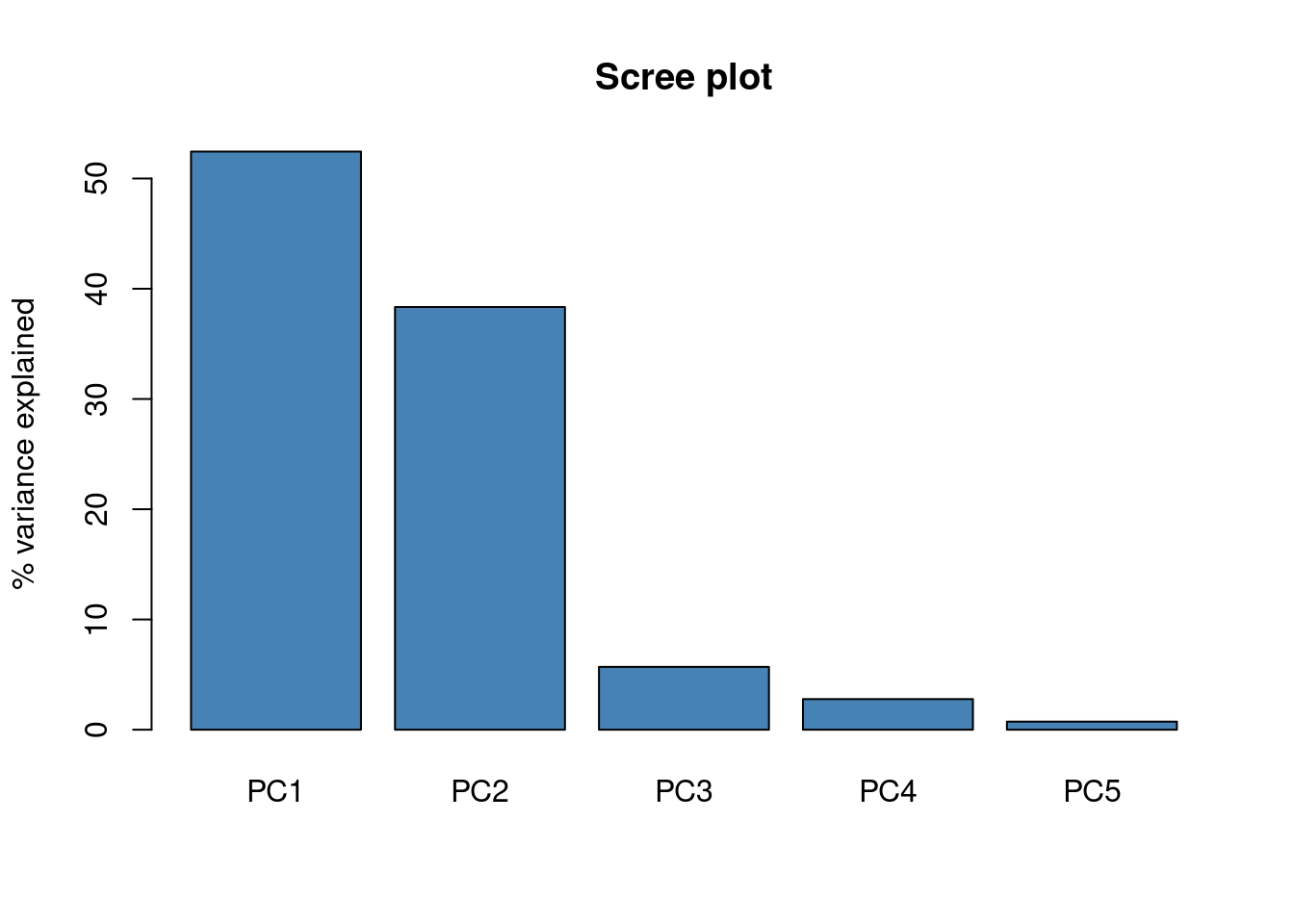
With only 5 genes, PC1 and PC2 already soak up most of the variation – this is the “scree plot” you’ll see quoted everywhere PCA is used, and it’s the standard way to decide how many PCs are worth keeping (look for the elbow where added components stop buying you much).
Checking the manual result against prcomp()
Everything above was done by hand (covariance matrix -> eigendecomposition) to make the mechanics concrete, but in practice you’d just call R’s built-in prcomp(). It’s worth checking that our manual PC1 direction agrees with what the built-in function finds.
pca_result <- prcomp(data, center = TRUE, scale. = FALSE)
summary(pca_result)
Importance of components:
PC1 PC2 PC3 PC4 PC5
Standard deviation 9.0133 7.7063 2.97114 2.0751 1.06696
Proportion of Variance 0.5245 0.3834 0.05699 0.0278 0.00735
Cumulative Proportion 0.5245 0.9079 0.96485 0.9927 1.00000# built-in PC1 loadings vs. our manual eigenvector
data.frame(
gene = rownames(t(data)),
manual_PC1 = largest_eigenvector,
prcomp_PC1 = pca_result$rotation[, 1]
) gene manual_PC1 prcomp_PC1
Gene1 Gene1 0.5298632 -0.5298632
Gene2 Gene2 -0.5224629 0.5224629
Gene3 Gene3 -0.0700673 0.0700673
Gene4 Gene4 -0.6563396 0.6563396
Gene5 Gene5 -0.1028898 0.1028898The two should point along the same axis (up to an overall sign flip, which is an arbitrary convention in eigendecomposition – eigen() and prcomp() don’t always pick the same sign for a given PC, but the line they describe is identical).
Biplot: samples and genes on the same axes
A biplot overlays both the sample scores (where each sample lands on PC1/PC2) and the gene loadings (how strongly each gene pulls in each direction) on one plot – a compact way to see which genes are driving the separation between samples.
biplot(pca_result, main = "PCA biplot: samples + gene loadings", cex = 0.8)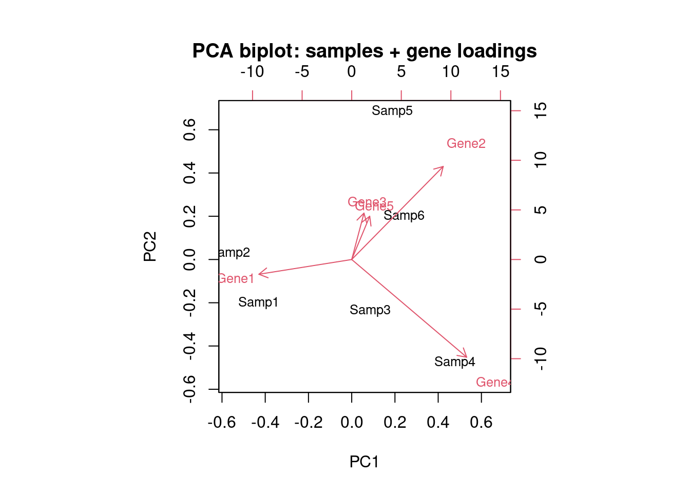
Genes whose loading arrows point in a similar direction are correlated with each other across samples; samples that land close together on the plot have similar expression profiles across all 5 genes, not just the two we scatter-plotted earlier.
Takeaways
- PCA finds the direction(s) of maximum variance in the data – with 5 genes, the first two PCs already explain the bulk of the total variation.
- The manual eigendecomposition and
prcomp()agree exactly on the PC1 direction, which is a good sanity check for understanding whatprcomp()is doing under the hood. - The scree plot is the standard tool for deciding how many PCs to keep in a real analysis.
- The biplot is the fastest way to see why samples separate the way they do – it shows which genes are responsible for the spread along each PC.